Junk Guys Logo Makeover: Secrets to Crafting a Standout Brand
If you run a junk removal business, your logo is often the first thing customers see—and judge. A refreshed, intentional Junk Guys logo can instantly communicate professionalism, trust, and reliability in a cluttered local market. Whether you’re rebranding an existing business or launching a new one, understanding what makes a junk removal logo stand out is critical to building a recognizable, profitable brand.
Below, we’ll break down how to rethink your logo from the ground up, what elements matter most, and the practical steps to turning your brand visuals into a real competitive advantage.
Why Your Junk Removal Logo Matters More Than You Think
In junk removal, many customers make fast decisions. They search “junk removal near me,” glance at a few profiles, and pick the business that looks the most legitimate and trustworthy. Your Junk Guys logo plays a major role in that snap judgment.
A strong logo can:
- Make you memorable among dozens of similar-sounding competitors
- Convey that you’re licensed, insured, and professional
- Support higher pricing by signaling quality and reliability
- Build recognition across trucks, uniforms, ads, and online listings
Brand research consistently shows that visuals drive recognition and trust; one study found that consistent brand presentation can increase revenue by up to 23% (source: Lucidpress / Marq Brand Consistency Report). Your logo is the anchor of that consistency.
Step 1: Clarify What “Junk Guys” Really Stands For
Before sketching a new Junk Guys logo, get clear on what your brand should represent beyond “hauling stuff away.”
Ask yourself:
- Who is your primary customer? (homeowners, property managers, contractors, seniors, realtors?)
- What are their biggest fears? (damage, hidden fees, no-shows, mess left behind?)
- What makes your team different? (speed, friendliness, eco-friendly disposal, transparent pricing?)
Write down 3–5 brand attributes you want your logo to reflect. For example:
- Fast
- Respectful
- Eco-conscious
- Local and approachable
These attributes will influence color, typeface, and any icons you choose for your new logo.
Step 2: Choose the Right Style for a Junk Removal Brand
Not every junk removal logo should look the same. There are a few common logo styles that work especially well for a company like Junk Guys:
-
Wordmark (Text-Only Logo)
- Focuses on the words “Junk Guys” with distinctive typography.
- Simple, versatile, and scales well on any surface.
- Great if your name is easy to remember and you want a clean, modern look.
-
Combination Mark (Text + Symbol)
- Pairs “Junk Guys” with an icon like a truck, bin, or simplified house.
- Powerful for truck wraps and social media profile images.
- Helps communicate what you do at a glance.
-
Emblem/Badge Style
- Encases the name and symbol in a shape (circle, shield, badge).
- Works nicely for uniforms and decals.
- Feels solid and traditional, like a trusted local service.
For most local haulers, a combination mark is the sweet spot: “Junk Guys” in bold, readable type, with a simple, memorable symbol that still looks clear from a distance.
Step 3: Color Psychology for a Strong Junk Guys Logo
Color is not just decoration—it sends a message before anyone reads the text. The color palette you choose for your Junk Guys logo should support your brand personality and be easy to reproduce on trucks, shirts, and print materials.
Common colors that work well in junk removal:
- Blue – Signals trust, reliability, and professionalism. Popular for service brands.
- Green – Conveys eco-friendliness, recycling, and cleanliness; ideal if you emphasize responsible disposal.
- Orange or Yellow – High-visibility, energetic, great for standing out on the road and in search results.
- Black or Dark Gray – Adds contrast and a sense of strength and dependability.
A strong palette might pair:
- A bold primary color (e.g., royal blue or bright green)
- A neutral (white, gray, or black)
- One accent color (like orange) for energy and callouts
Keep it simple: 2–3 colors are usually enough for a flexible, professional look.
Step 4: Typography That Works Hard for You
Your font choice can make the difference between “cheap and messy” and “professional and trustworthy.”
For your Junk Guys logo, prioritize:
- Readability from a distance – Your name must be legible on a truck driving by at 40 mph.
- Boldness – Slightly heavy or bold fonts are easier to read on signs and digital thumbnails.
- Personality that matches your brand –
- Sans-serif fonts (like Montserrat, Lato, or Poppins) look modern and clean.
- Slightly rounded fonts can feel more friendly and approachable.
Avoid overly decorative or script fonts. In junk removal, clarity beats cleverness. Consider using one primary font for “Junk Guys” and a simpler font for a tagline like “Junk Removal & Hauling” to keep hierarchy clear.
Step 5: Designing the Perfect Icon or Symbol
If you include a symbol in your new Junk Guys logo, it should:
- Be immediately connected to what you do
- Look good at both small and large sizes
- Stay simple enough to print and embroider easily
Effective icon ideas:
- A simplified truck silhouette with a tidy load in the back
- A bin or dumpster with clean lines
- A house outline with clutter turning into clean space
- A recycling or refresh symbol if your focus is eco-friendly hauling
Avoid overly detailed illustrations. When shrunk down for a website favicon, Facebook profile, or business card, fine details disappear. Think in terms of clear shapes that still make sense when they’re small.
Step 6: Make It Flexible and Scalable
The best logos don’t just look good on a computer screen; they perform everywhere.
Your updated Junk Guys logo should have:
- Full-color version – For your website, printed materials, and main truck graphics.
- One-color version – For stamps, invoices, embroidery, and low-cost printing.
- Horizontal and stacked versions – To fit narrow website headers and tall social media placements.
- Vector format files (SVG, AI, EPS) – So the logo can be resized without losing quality.
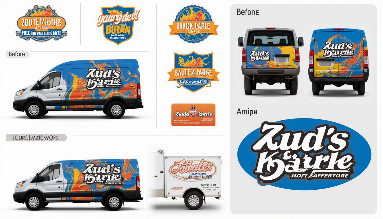
Test your logo in real-world situations: How does it look on the side of a white truck? On a dark t-shirt? In black and white on an invoice? Making adjustments now saves expensive reprints later.
Step 7: Keep It Clean and Avoid Common Mistakes
Many junk removal logos fail because they try to do too much or use outdated design styles. During your Junk Guys logo makeover, watch out for:
- Too many colors – Raises printing costs and looks chaotic.
- Tiny taglines – They’ll vanish at small sizes. Focus on the main name first.
- Clip art or stock icons – Makes your brand look generic and cheap.
- Trendy effects – Gradients, 3D text, and shadows can age quickly.
- Crowded layouts – Leave breathing room; whitespace makes your logo feel more premium.
Think timeless, not trendy. A logo that still looks sharp ten years from now is more valuable than one that chases current fads.
Step 8: Get Feedback from Real Customers
Before you lock in your final Junk Guys logo design, test it with people who resemble your target customers.
Ways to gather feedback:
- Show 2–3 options to past clients and ask: “Which one feels most trustworthy?”
- Run a simple poll on social media groups or your email list.
- Ask family and friends, but prioritize people who match your actual buyer profile (e.g., homeowners 35+, realtors, property managers).
Look for patterns: if most people describe one logo as “clean” and “professional,” and another as “messy” or “cheap,” you know which direction builds your desired brand image.
Step 9: Apply Your New Logo Everywhere Consistently
The power of a well-designed Junk Guys logo comes from repetition. Once you’ve finalized the design, roll it out systematically.
Update:
- Trucks and trailers – Your largest moving billboards. Invest here first.
- Uniforms and safety gear – Hats, shirts, jackets, vests. Consistent apparel signals reliability and team unity.
- Website and online listings – Homepage, favicon, Google Business Profile, Yelp, Angi, Thumbtack, Facebook, Instagram, Nextdoor.
- Print assets – Business cards, door hangers, flyers, yard signs, estimate forms, invoices.
- Email and documents – Email signatures, quotes, contracts, and letterheads.
Create a simple brand guide—even if it’s just a one-page PDF—that shows logo versions, color codes (HEX/CMYK), and font names. Share it with any designer, printer, or marketer you work with to maintain consistency.
Step 10: Use Your Brand Story Alongside the Logo
A logo alone can’t tell your whole story, but it should introduce it. Support your Junk Guys logo with a short, clear brand message wherever you show the logo.
Examples of supporting lines:
- “Fast, friendly junk removal you can trust.”
- “Local pros. Honest prices. No junk left behind.”
- “Eco-conscious hauling for homes and businesses.”
Pairing a concise statement like this with your logo on trucks, the homepage, and ads makes your value instantly clearer—and helps you stand apart from generic competitors.
Quick Checklist for a Standout Junk Guys Logo
Use this checklist as you finalize your logo makeover:
- [ ] Name is large, bold, and clearly legible from a distance
- [ ] Color palette is limited (2–3 colors) and fits your brand traits
- [ ] Symbol or icon is simple, relevant, and recognizable when small
- [ ] Design works on both light and dark backgrounds
- [ ] Vector files and alternate layouts (horizontal/stacked) are created
- [ ] One-color version is clean and legible
- [ ] Real-world mockups (trucks, shirts, web header) have been reviewed
- [ ] Brand guide with logo, colors, and fonts is documented
If every box is checked, you’re on your way to a durable, high-impact logo.
FAQ: Junk Removal Branding & Logos
1. How do I design a Junk Guys logo without hiring an expensive agency?
Start by clarifying your brand values and target customer. Then use a reputable logo design platform or work with a freelance designer. Provide clear direction: preferred colors, simple icon ideas, and examples of service logos you like. Ask for vector files and multiple versions so you can use the logo anywhere.
2. What makes a good junk removal company logo different from other service logos?
A strong junk removal company logo emphasizes clarity and trust, but it also benefits from visual cues like trucks, bins, or recycling icons that instantly show what you do. High contrast, readable type, and a clean, clutter-free layout are especially important because logos often appear on moving vehicles and yard signs viewed from a distance.
3. How often should I update or refresh my junk removal logo and branding?
Most service businesses refresh their branding every 7–10 years, or sooner if the logo no longer reflects their quality or positioning. If your current junk hauling logo looks dated, inconsistent across platforms, or confusing at small sizes, it may be time for a thoughtful makeover rather than a complete rename.
Turn Your Junk Guys Logo Into a Growth Engine
A polished, intentional Junk Guys logo is more than a nice graphic—it’s a sales tool that works 24/7. When your trucks roll through neighborhoods, your ads appear online, and your business shows up in search results, that logo is quietly telling customers who you are and why they should trust you.
If you’re ready to stand out in a crowded junk removal market, don’t settle for a rushed or generic design. Invest the time now to define your brand, craft a clear and memorable logo, and roll it out consistently across every touchpoint. The result: more recognition, more calls, and a stronger, more profitable business built on a brand that truly represents the quality of the work you do.
Junk Guys San Diego
Phone: 619-597-2299
Website: www.junkguyssd.com
Email: junkguyssd619@gmail.com